
Harmony in Interior Design: Creating Cohesive, Timeless Interiors
- Jan 6
- 9 min read

Table of Contents:
Harmony in interior design means creating spaces where all elements work together rather than compete. Through unity design principles like repetition, consistent palette, and balanced proportions, harmony makes rooms feel intentionally curated rather than randomly assembled.
It's the difference between sophisticated design and visual chaos. |
Walk into a beautifully designed room and you feel it immediately: a sense of rightness, of everything belonging exactly where it is. That feeling has a name: harmony.
Harmony in interior design means more than matching furniture or coordinating colors. It represents the sophisticated interplay of all elements working together to create intentional spaces.
Where discord creates visual chaos and emotional unease, harmony creates calm, clarity, and the quiet confidence of rooms designed with purpose.
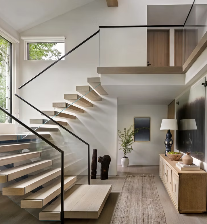
In luxury mountain homes, where soaring ceilings and dramatic natural materials demand careful orchestration, harmony becomes essential. Too many competing elements create confusion. Too little variety feels sterile. Harmony strikes the balance.
What Is Harmony in Interior Design?
Harmony occurs when all design elements relate to each other rather than compete. Design harmony means elements work together through shared characteristics: similar colors, complementary materials, balanced proportions, or consistent style language. Nothing jars. Everything belongs.
What harmony is:
Visual unity where elements relate rather than compete
Intentional curation creating sense of completion
Sophisticated layering that feels collected over time
Balance between variety and consistency
What harmony is NOT:
Matching everything (creates monotony, not harmony)
Single-style adherence (mixing styles can be harmonious with proper unity)
Absence of contrast (harmony includes controlled variety)
Sacrificing personality for cohesion
The result: Rooms with harmony feel collected, intentional, and complete. They provide visual rest rather than stimulation. You look around and feel satisfied rather than searching for what's missing or what's wrong.
Why Harmony Matters

Harmonious spaces affect us in ways we don't consciously notice but definitely feel. Our brains constantly process visual information, looking for patterns.
Harmonious rooms allow easy pattern recognition through repeated colors and materials, which reduces mental effort and creates calm. Discord does the opposite, activating subtle stress as our minds try resolving visual conflicts.
In luxury design, harmony signals sophistication and intentionality, the difference between "decorated" and "designed," between displayed wealth and cultivated taste.
In mountain homes especially, where dramatic natural elements already command attention, interior harmony creates restful counterbalance that allows architecture and views to shine.
Understanding Unity Design Principle
Unity and harmony work as interconnected principles. Think of unity as the technique and harmony as the result. Unity provides the tools (repetition, consistency, visual flow) that create harmonious outcomes.
How Unity Creates Harmony
Unity means all parts of a design relate to and complement the whole through:
Repetition: Colors, materials, or shapes appearing multiple times create subconscious connection. Wood tones in flooring, furniture, and beams feel unified even when pieces come from different eras.
Consistency: Similar finish quality, scale relationships, or style language thread through space, connecting individual pieces into a cohesive whole.
Visual flow: Elements arranged so the eye moves comfortably without jarring stops or confusing jumps.
Strategic connection: Deliberately linking elements through shared characteristics (pillow fabric echoing artwork colors, brass repeated in lighting and hardware).
2025 luxury design increasingly values curated, collected aesthetics over matching sets. Unity becomes essential as the technique allowing sophisticated mixing. You can combine mid-century chairs with contemporary sofa and traditional rug if unity principles connect them through color, material, or proportion.
The Four Elements of Harmony
Principles of design harmony rely on four specific elements working together. Master these, and harmony follows naturally.
1. Color Harmony
The most powerful tool for creating design harmony.
Harmonious Color Approaches
Color Approach | How It Works | Best For | Example |
Monochromatic | Varying shades/tones of single color | Sophisticated, timeless spaces | Beiges from cream to taupe throughout |
Analogous | Adjacent colors on color wheel | Spaces needing color variety with unity | Blues flowing into greens, browns into terracotta |
Complementary | Opposite colors, one dominates (60-70%) | Dynamic spaces with bold accents | Blue dominant with orange accents |
Neutral Foundation | 70-80% neutrals, 20-30% accent colors | Luxury interiors prioritizing longevity | Warm whites/beiges with navy or sage accents |
The 60-30-10 rule: Classic proportion creates color harmony through clear hierarchy. 60% dominant color (usually neutral: walls, large furniture), 30% secondary color (accent furniture, window treatments), 10% accent color (pillows, small accessories, art).
One color dominates, providing foundation. Secondary supports without competing. Accent adds interest without overwhelming.
Mountain home consideration: Warm neutrals (beiges, taupes, warm whites) harmonize naturally with wood, stone, and leather, creating unity between architecture and interiors in alpine settings.
What disrupts color harmony: Too many accent colors without dominant palette, colors competing for equal attention without hierarchy, or mismatched undertones (cool grays with warm beiges creates subtle discord).
2. Material Harmony
Repeated materials create subconscious unity throughout spaces.
Effective strategies:
Repeat 2-3 primary materials (wood, brass, linen appearing multiple times)
Vary applications while maintaining material (brass in chandelier, cabinet hardware, picture frames, lamp bases)
Balance natural and manufactured materials (stone with metal, wood with glass)
Consider finish consistency (all matte or all polished reads more harmonious than random mixing)
Texture relationships: Complementary textures create harmony: smooth marble with rough linen, polished wood with nubby boucle, sleek leather with organic rattan. Similar texture families relate better than random variety.
Example: If dining chairs feature walnut frames, echo walnut in credenza, side table, or picture frames. The wood repetition creates visual thread connecting pieces even when styles differ dramatically.
3. Scale and Proportion Harmony
Elements must relate proportionally to create visual harmony. This matters enormously in mountain homes with cathedral ceilings.
Requirements:
Furniture pieces share similar visual weight (substantial with substantial, delicate with delicate)
Architectural scale honored (20-foot ceilings need substantial furniture, not apartment-sized pieces)
Relationships feel intentional (oversized lamp with petite table feels discordant)
Negative space balanced (neither cluttered nor empty)
The squint test: Step back and squint. Masses and weights should feel balanced, not clustering heavily in one area while others feel empty. This simple technique reveals proportion problems your focused eye might miss.
4. Style Harmony
Even mixed-style rooms require unifying aesthetic thread.
Creating style harmony:
Limit to 2-3 complementary style influences maximum
Establish dominant style representing 70-80% of elements
Use transitional pieces to bridge very different styles
Share common design language (all organic shapes, all clean lines, all traditional silhouettes)
DESIGNER TIP Harmony doesn't require matching styles. It requires that styles relate to each other. Mid-century and contemporary share clean lines and organic forms, creating natural harmony.
Ultra-formal, traditional, and industrial require more careful bridging through transitional pieces and unified color palette. |
Creating Harmony Room by Room

How to achieve harmony varies by space, each with unique requirements.
Room | Harmony Priority | Key Strategy | Color Limit | Critical Element |
Living Room | Layered complexity | Cohesive palette + repeated materials | 3-5 colors | Balance visual weight across room |
Kitchen | Material coordination | Limit to 3-4 materials, ONE metal finish | 3-4 colors | ALL metal finishes must match |
Bedroom | Restful calm | Simplified palette, consistent wood tones | 2-3 colors | Limited pattern, softer contrast |
Dining Room | Focal drama | Coordinated finishes, style consistency | 3-4 colors | Metal finish repetition |
Living room example: Contemporary linen sofa + mid-century walnut chairs + traditional Persian rug = harmonious when unified through a warm neutral palette (cream, brown, gold), repeated wood tones, and brass accents in lighting and hardware.
Kitchen harmony critical rule:Coordinate all metal finishes intentionally. The most foolproof approach: pick ONE finish (brass, nickel, or black) for faucets, hardware, and fixtures.
Stainless steel appliances: Don't try to match faucets and hardware to stainless steel. Choose a contrasting finish (brass, nickel, or black) and keep faucets and hardware consistent with each other.
Intentional contrast: Some finish combinations work when deliberately paired. A chrome faucet with matte black cabinet hardware creates purposeful contrast. The key: intentional pairing, not random mixing. Brass faucet + nickel hardware + chrome appliances = discord.
Bedroom harmony principle: Visual calm supports rest. Simplified palettes, consistent wood tones, limited pattern variation. Busy, discordant bedrooms create subtle stress counter to the room's restorative function.
Common Harmony Mistakes in Luxury Interiors
Even sophisticated spaces fail when harmony principles are ignored.
Mistake | Why It Fails | The Fix |
Too many accent colors | Five colors compete for attention | Limit to 1-2 repeated accent colors |
Mismatched metal finishes | Brass + nickel + chrome = discord | Coordinate intentionally; keep faucets + hardware consistent (don't match stainless appliances) |
Clashing wood tones | Random mix creates confusion | Vary intentionally (light, medium, dark) OR keep similar |
Every piece a statement | Nothing gets attention when everything demands it | Create hierarchy; some pieces shine, others support |
No unifying thread | Beautiful pieces with no relationship = chaos | Establish at least one connecting element |
Ignoring negative space | Over-styling creates visual exhaustion | Leave breathing room between elements |
Additional disruptors:
Mismatched undertones: Cool gray walls with warm beige furniture creates subtle discord many people feel but can't identify. Stay within warm or cool family consistently.
Inconsistent finish quality: Mixing high-gloss and matte finishes randomly (not intentionally for contrast) disrupts harmony.
Scale jumps without transition: Moving from massive furniture to tiny accessories without medium-scale pieces creates jarring visual jumps.
Advanced Harmony Techniques

Triadic Harmony
Using three colors equally spaced on color wheel (blue, yellow, red, green, orange, purple) requires careful balance. Let one color dominate (60%), others support (30% and 10%). Without this hierarchy, triadic schemes create chaos rather than harmony.
Transitional Bridging
Connect very different elements through transitional pieces that share characteristics with both:
Neutral contemporary rug grounds traditional furniture and modern accessories
Transitional lighting (clean-lined but warm materials) bridges contemporary and traditional
Simple solid-fabric sofa allows bold patterned chairs and dramatic coffee table to harmonize
Rhythm Through Repetition
Create visual rhythm through strategic repetition:
Three instances of brass throughout the room (odd numbers create better rhythm than even)
Similar shapes recurring (rounded coffee table, curved chair backs, circular mirror)
Pattern repetition in varied scales (large geometric rug, medium geometric pillows, small geometric accessories)
"Harmony doesn't happen by accident," explains Cofounder and Principal Designer Carrera Shea. "It requires intentional decisions about what to repeat, what to vary, and how everything relates. In mountain homes especially, we're orchestrating natural materials, dramatic architecture, and sophisticated furnishings. Harmony is what makes all those elements feel like they belong together rather than compete."
Creating Harmonious Interiors with ALI & SHEA DESIGN
At ALI & SHEA DESIGN, we approach harmony as fundamental to luxury mountain home design. It's the principle that transforms collections of beautiful elements into unified, sophisticated spaces.
Our comprehensive design process emphasizes harmony from initial planning through final styling. We understand how architectural elements, natural materials, and furnishings must relate to create spaces that feel both dramatic and calm, powerful yet peaceful.
Our approach includes:
Establishing color palettes that honor mountain architecture while providing interior sophistication
Selecting materials that create unity through strategic repetition across spaces
Balancing proportions appropriate to cathedral ceilings and expansive mountain home scale
Curating furnishings that relate harmoniously despite mixing styles and eras
Styling completed spaces where every element contributes to unified whole
Whether renovating historic Aspen properties or building new in Snowmass, we create interiors where harmony elevates every design decision.
The result: spaces that feel collected over time, intentionally curated, and completely unified despite their sophisticated layering.
Contact ALI & SHEA DESIGN to discuss how harmony principles create sophisticated mountain home interiors. |
Frequently Asked Questions
What is harmony in interior design?
Harmony means all elements (color, material, scale, style) work together to create unified spaces rather than competing for attention.
Created through: repeated colors and materials, balanced proportions, consistent style language, and strategic unity design principles.
Harmony makes spaces feel intentionally curated and complete.
What does harmony mean in interior design vs. unity?
Harmony is the result (the unified, resolved feeling). Unity is the technique (repetition, consistency, visual flow).
Unity provides the strategies. Harmony is what you experience when those strategies succeed.
What are the principles of design harmony?
Four key elements:
Color harmony (monochromatic, analogous, or neutral-dominant schemes)
Material repetition (2-3 materials repeated throughout)
Proportional balance (similar scale relationships)
Style consistency (2-3 complementary influences maximum)
Apply through unity strategies: intentional repetition and strategic consistency.
How do you create harmony in a living room?
Establish color palette: 3-5 colors maximum using 60-30-10 proportion
Repeat materials: Brass in lighting, hardware, accessories; wood tones in furniture and floors; complementary textiles
Balance visual weight: Distribute substantial and delicate pieces evenly
Limit style influences: 2-3 complementary styles with one dominant (70-80%)
Can you have harmony with mixed furniture styles?
Yes. Harmony doesn't require matching styles. It requires styles relate through shared characteristics.
Strategies: Unified color palette, repeated materials across eras (brass, wood, linen), similar proportions, 2-3 style influences maximum, transitional pieces bridging different aesthetics.
Mid-century and contemporary harmonize naturally through shared clean lines. Traditional and industrial require more careful unity through repeated materials and colors.
What's the difference between balance and harmony in design?
Balance focuses on visual weight distribution (how masses feel evenly distributed across space).
Harmony is about unity (how all elements relate through color, material, scale, style).
They work together but serve different purposes. Balance contributes to harmony, but harmony encompasses broader relationships beyond weight and placement.


Comments