
How to fill Negative Space in Mountain Home Design
- May 17
- 9 min read

Table of Contents:
WHAT IS NEGATIVE SPACE IN INTERIOR DESIGN? Negative space in interior design is the deliberate, unoccupied area surrounding objects, furniture, and architectural elements. It is the space you are choosing not to fill. Used intentionally, it does four things:
|
Most rooms feel overcrowded, not because they have too much furniture, but because nothing has been given room to be seen. Every surface is occupied. Every wall is addressed. Every corner has a purpose. The result is a room that works hard and feels exhausting.
Negative space in interior design is the discipline of resisting that instinct. It is the decision to leave things out, to let surfaces breathe, to give each object a clear sight line. In practice, it is one of the most consistently underused tools in residential interior design, and one of the most immediately effective when applied well.
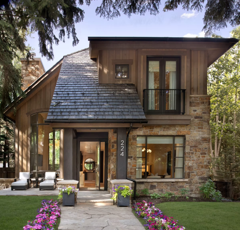
In mountain homes in Aspen and Snowmass, it matters more than almost anywhere else. The architecture sets a high bar. The landscape is doing significant work through the windows. When a room is filled beyond consideration, it competes with both. ALI & SHEA DESIGN works with these conditions every day. This is how we think about it.
WORKING ON AN ASPEN OR SNOWMASS HOME? ALI & SHEA designs mountain homes where every decision is deliberate. If you want a room that feels considered rather than filled, we would like to hear about your project. Contact ALI & SHEA DESIGN |
What Negative Space Actually Does in a Room

Negative space is not a style. It is not minimalism with a different name. The question is not how little you have in a room. The question is whether what you have is visible.
One sculptural piece on a clear surface reads as a decision. The same piece among twelve others reads as clutter. Nothing about the piece has changed. Remove the space around it, and you remove its ability to mean anything.
The practical argument: negative space is not about having less. It is about making what you have matter. A room where everything is visible is a room where everything is a choice. A room where nothing has breathing room is a room where no choice is legible.
DESIGNER NOTE The most common thing we hear from clients is: the room feels unfinished. It is rarely unfinished. The instinct to fill the remaining space is the one we push back on most consistently. Empty is not unfinished. Empty is often exactly what the room needs. |
How to Use Negative Space in Interior Design: Four Practical Decisions

Negative space is not achieved by removing things at random. It requires a specific way of thinking about each surface, each object, and each plane in a room. Here are the four decisions that make the difference between a room that feels resolved and one that feels overcrowded or half-finished.
1. Edit Before You Add
The default approach to decorating is additive: you select what you want and place it. The discipline of negative space requires the opposite starting position. Before you add anything, ask what is already in the room that is not earning its place.
A piece of furniture earns its place if it is used, if it reads as intentional, and if removing it would leave a gap rather than a relief. An object on a surface earns its place if it is specifically chosen rather than accumulated. The rooms we design that feel most considered are almost always the result of subtraction before addition.
2. Give Each Object a Sight Line
Every object in a room should have a clear line of sight from at least one natural viewing position, usually the primary seating. If you cannot see an object clearly from where you sit, it is functioning as fill rather than as a presence. A vase behind three other objects on a shelf is not contributing to the room. It is contributing to the sense that the shelf is full.
The practical test: sit at the primary seating position and look at each surface in the room. Identify the objects you genuinely see versus the objects that register only as density. The ones that register as density are candidates for removal.
3. Surface Breathing Room
A surface needs empty space to function as a surface. A credenza with objects along its entire length reads as a storage unit. A dining table with a single centrepiece reads as a dining table. The surface itself becomes part of the composition only when there is enough of it visible.
The rule we apply: no more than one-third of any horizontal surface occupied. A generous stretch of clear walnut credenza, unoccupied and visible, does more for a room than the same surface fully dressed.
4. Floor and Wall Plane Discipline
Negative space operates in three dimensions. Furniture pushed to the walls to create the illusion of floor space often creates the opposite effect: everything cleared to the edges, the centre abandoned. Pull furniture in and leave a deliberate empty floor behind it.
Wall plane discipline means not addressing every wall. One or two walls in a room should be left clear or nearly clear. A room where every wall has artwork, shelving, a mirror, or a sconce has no wall plane at all. The quiet walls are what make the addressed walls legible.
APPLYING THESE PRINCIPLES TO A ROOM IN PROGRESS? ALI & SHEA DESIGN works through the editing discipline on every room we design. If you are working on a mountain home in Aspen or Snowmass and want a room that feels resolved, we would like to think through it with you. Get in Touch ALI & SHEA DESIGN |
Negative Space in Mountain Homes: The Specific Conditions

Everything above applies to any interior. In mountain homes, negative space operates at a different scale and under different pressures, and the consequences of getting it wrong are proportionally larger.
The View Is the Room's Primary Negative Space
In Aspen and Snowmass homes with floor-to-ceiling glazing and mountain views, the landscape outside is already the most powerful element in the visual composition. A room designed around the view as its primary negative space treats the landscape as an active participant. A room that competes with the view for attention loses that competition without exception.
The furniture, objects, and surfaces in a view room should be edited more rigorously than in any other room type. Low-profile furniture, clear horizontal surfaces, and walls left quiet: all of these choices acknowledge that the view is the point, not the room.
Great Room Scale and the Filling Trap
Mountain home great rooms create a specific pressure. The volume is large, and the instinct is to fill it proportionally. The discipline is to work with the scale rather than against it. A great room with intentional negative space in the vertical plane, high ceilings left clear, volumes left unaddressed, feels grounded and settled. A great room filled to its height feels anxious, regardless of how good the individual pieces are.
Two well-chosen large pieces of furniture with clear space between them resolve a great room more effectively than six medium pieces arranged to fill the floor plan. The negative space between substantial pieces is what creates the sense of consideration.
Vertical Breathing Room
In rooms with high ceilings, negative space extends upward. Leave the upper third of the room alone. A single large-scale artwork positioned at eye level against a clear expanse of wall reads more powerfully than the same wall addressed from floor to ceiling. The wall above and around it is doing the work.
DESIGNER NOTE The most resolved mountain home rooms we design share one quality: they look slightly under-furnished when empty and completely right when occupied and in use. The negative space is held for the people in the room, not for additional objects. When you are sitting with a fire going and a view of the Elk Mountains, the empty space becomes occupied by light, by movement, by the landscape. That is exactly what it was designed for. |
What Gets in the Way: Common Mistakes
These errors all come from the same assumption: that more is more resolved.
What Goes Wrong | Why It Fails and the Fix |
Filling every surface | A dressed surface and a resolved surface are not the same thing. When every horizontal surface is occupied, the room has no resting points for the eye. Start with one-third occupied, two-thirds clear. Adjust up from there, never down. |
Treating empty space as unfinished | A room where every surface has been filled in because it felt incomplete is one that has been over-edited in the wrong direction. The filling was the error, not the space. Once you have edited to the point of discomfort, you are usually close to right. |
Over-accessorising a view room | In a room where the view is the primary design element, every additional object is competing with the landscape. The view does not need support. It needs the room to step back. Edit a view room more aggressively than any other room in the house. |
Confusing negative space with minimalism | Negative space is a compositional discipline. Minimalism is a style. A materially rich room with stone, timber, and wool textiles uses negative space as effectively as a spare white room. The question is not how little is in the room. It is whether what is there has been given room to be seen. |
Working With ALI & SHEA DESIGN
Negative space is one of the disciplines that is easy to understand and difficult to apply under pressure. The instinct to fill, to add, to address every surface is constant. Resisting it at every stage of the design process is what makes the difference between a room that impresses and a room that settles.
If you want a home where every object matters, where the rooms feel considered rather than filled, and where the scale of a mountain home works with you rather than against you, that is the work we do in Aspen and Snowmass.
IF YOU WANT A ROOM WHERE EVERY DECISION IS LEGIBLE, LET'S TALK. ALI & SHEA DESIGN offers full-service interior design and architecture for mountain homes in Aspen and Snowmass. We ask different questions before we draw a line. The goal is not to win approvals. It is to design a life. Contact ALI & SHEA DESIGN |
Frequently Asked Questions
What is negative space in interior design?
Negative space in interior design is the deliberate, unoccupied area surrounding objects, furniture, and architectural elements. It is the space you are choosing not to fill. Used intentionally, it makes each object visible and legible, controls where attention goes, and signals that every choice in the room was specific rather than accumulated. It is not the absence of decisions. It is itself a decision, and often the most consequential one in a room.
How do you use negative space in interior design?
Start with subtraction rather than addition. Before placing anything new, ask what is already in the room that is not earning its place. From there, give each object a clear sight line from the primary seating position; leave at least two-thirds of every horizontal surface clear; address only one or two walls per room, and leave the others quiet. In mountain homes with significant views, apply every one of these more rigorously than you think you need to. The landscape outside is already doing the primary work. The interior's job is to step back far enough to let it.
Is negative space the same as minimalism?
No. Minimalism is a style defined by the deliberate reduction of material richness and decoration. Negative space is a compositional discipline that applies to any interior regardless of style. A room with stone walls, exposed timber, and textured wool textiles can use negative space as effectively as a sparse white room with almost nothing in it. The question is not how little is in the room. It is whether what is there has been given room to be seen. Minimalism answers that with reduction. Negative space answers it with editing. They are not the same thing.
How does negative space work in large mountain home great rooms?
Great rooms amplify every spatial decision. Two substantial pieces of furniture with clear space between them resolve a great room more effectively than six medium pieces filling the floor plan. Leave the upper third of the volume clear: ceiling height that is left unaddressed feels like space; ceiling height that is fully addressed feels like compression. And treat the mountain view as the room's most powerful negative space. The landscape is already doing significant compositional work. The room's job is not to compete with it. It is to frame it.


Love the focus on negative space in mountain homes—it’s so easy to overfill those cozy interiors. I’ve been using https://vo3-ai.net
Great tips on using negative space to keep a mountain home feeling open and airy. I've been using https://crealitycloud.org
Love the focus on using negative space to highlight natural textures. I've been experimenting with similar principles in my own projects and found a great resource at https://ai-video-maker.net
Thoughtful interior design can have a significant impact on how a space feels, especially when simplicity and openness create a sense of calm. Those qualities are just as important in wellness environments, where clients come to relax and recharge. If you're looking to rent space for yoga studio, a bright, peaceful, and professionally designed studio can help create the ideal atmosphere for every class.
Love the focus on using negative space to highlight natural textures in mountain homes. I've been experimenting with similar concepts using https://make-ai-video.com